
Web presence of your company is no longer a side-thing to your business, it is regarded to be a part of your business model. When properly done, it can be served as a potent means of ensuring engagement and the growth in conversion rates. Site design is a critical element that can be used to ensure that one is able to capture the attention of the user, and then guide him or her into taking the targeted actions.
In this article, we will be deconstructing the basic elements of effective web page design and understand the psychology of the user experience and give applicable strategies on how your site can be well designed so that it can be a source of success.
The Impact of Website Design on Conversions
Do you know that users develop opinion regarding your website within a time of 0.05 seconds? That is the importance of first impression of ascertaining whether a person will stay on a website or not. Design is not only creating something that looks good, it’s also concerned with usability, trust and functionality.
What Are Conversions?
A conversion denotes any action that a user undertakes on your website, which you wish to happen. It can consist of such things like:
- Complete contact form
- News letter subscription
- Making a purchase
- The action buttons can be clicked
- Downloading an app or other resource
Well designed websites will achieve these outcomes, and the user experience (UX) will be in line with what you want.
Key Design Elements That Drive Conversions
1. Responsive Design for Seamless Accessibility
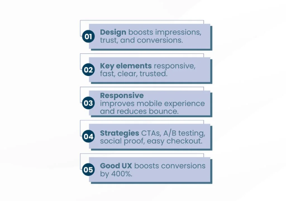
The mobile internet traffic makes up more than 60 percent of the traffic to websites around the world. When your site is not optimized to fit various screen sizes, you are losing a good number of potential customers.
Since the responsive design is the one which adapts your site to the device (desktop, tablet, or smartphone), the responsive design will automatically adapt the site to the device. It makes it easier to use, and it makes the experience consistent, and it lowers the conversion thresholds.
Implementation Tip: Test your website on different devices and orientations to respond to them. You can use such tools as Google Mobile-Friendly Test to get additional information.
2. Clear and Intuitive Navigation
The structure of a site can be poor and this will make users avoid exploring or taking the important actions The navigation has to be user-friendly, menu structures have to be logical and one should not have to make too many clicks in order to find the necessary information.
Best Practices for Navigation Design
- Menus are to be named short and descriptive.
- Navigation bars ought to be fixed or sticky
- Include a search bar in the websites that contain more than one page.
- There should not be too many top level menu categories
When the user can locate what they need without any difficulty, it helps in reducing friction and makes the user take an action, which ultimately leads to an increase in conversions.
3. Fast Loading Speeds
Slow-moving web sites are murderous to conversions. It has been found out that 53 percent of the users will leave a page when it takes more than 3 seconds to load. The speed of loading is not only the indicator of the performance, but also the indicator of the trust and professionalism.
What to Do About It
- Put your code to the minimum and compress your images to make them smaller.
- Content Delivery Network (CDN) and caching in the browsers.
- Monitor the speed of the site with the help of such tools as GTmetrix or Google PageSpeed Insights and improve it.
The sooner your web page loads, the better the chances of the user staying to consume the information in the page.
4. Engaging Visual Hierarchy
Visual hierarchy is the way of organizing the elements so as to direct the attention of users. The strategic positioning of headlines, images, buttons and blank spaces can attract the attention of the users to the points of conversion such as forms or call-to-action (CTA) buttons.
Elements of a Strong Visual Hierarchy
- Contrast: The CTA buttons need to be made visible by making them of different color to the background.
- Typography: There will be bigger and different headings and body.
- Images: To direct the attention and concentration on valuable messages, excellent pictures are to be provided.
When users are taken through using visual aids, they will be more inclined to take your desired actions.
5. Trust-Building Components
Lack of trust is one of the conversion killers. People will not divulge their information or buy anything unless they have confidence in your site as being credible
How to Build Trust Through Design
- Publish testimonials, reviews or testimonies of your customers.
- Security badges, e.g. SSL certificates, credit card badges (e.g. PayPal Verified).
- Make the statements of the privacy policy, the statements of the refund policy and the statements of the terms of service clear.
- Avoid irritating pop ups that can be annoying to the users.
Trust eliminates uncertainty and speeds up the process of making decisions leading to increased conversions.
Crafting a User-Experience-Centric Design
User-Centered Design Strategy
The User Centered Strategy of Design is an approach that aims at providing the user with the best experience possible.
Three UX Principles for High Conversions
- Simplicity: Do not give too much to the users. Each page must have one objective and all the design elements must be directed towards the objective.
- Consistency: The features of design should be like on other pages in the aspect of color schemes, fonts etc. Uniformity will improve brand image and make it easy to the user.
- Interactive Feedback: To give the user the immediate response, feedback can be given, e.g. button effects, form validation messages.
Friction Reduction
Friction is anything that impedes the flow of the user. For example:
- Overcomplicated forms
- Poorly labeled buttons
- Misleading elements that confuse users
By eliminating them with a user-friendly design, you will reduce the number of frustrations and make users follow through to your CTAs without any hitch.
Pro Tip: You can check how users behave with the help of such tools as heatmaps or session replays to identify friction areas.
Strategies to Optimize for Better Conversion Rates
1. Compelling Call-to-Actions (CTAs)
CTAs may be the final hurdle to put in place before a conversion make sure that they are:
- Action-Oriented: The language that will be used must be commanding such as; Register Now or Get Your Free Trial.
- Easy to Read: The CTAs must be placed on the upper part of your page and repeated when there is the need to do so.
- Urgent: Use urgency by stating things like, “Limited Time Offer” to make people take action.
Pro Tip: A/B test the location of your CTAs, words and colors to find out which one is the most effective.
2. Split Testing for Continuous Improvement
Split testing is the process of testing two or more versions of a web page with the objective of finding out which one will work better.
What Elements Should You Test?
- Headlines and subheadlines
- Button colors and positions
- Form designs and lengths
- The pages of the products or services
3. Social Proof Integration
Social proof provides the users with the confidence of decision making. Showing the actual evidence of the effect of your product can go a long way.
Ways to Add Social Proof
- Find good tweets or Instagram posts of people following you and use them.
- Give live statistics such as how many people are viewing a particular item e.g., 2000 people are viewing this item.
- Award and certification.
Social validation makes the customers sure that they are dealing with a credible company.
4. Simplify Checkout Processes
Abandoned carts are a major problem when it comes to e-commerce websites. The design changes can also make the checkout process easier and boost the conversion rates.
Key Improvements
- Minimize the size of the fields of the forms.
- Progress indicators should be placed in order to inform the users about the remaining steps.
When the process of checking out is smooth and does not cause any stress, the users tend to make their purchases much more frequently.
Final Thoughts
An effective website is more than a billboard on the highway, it is a dynamic conversion tool that will help you grow your business. With the emphasis on responsive design, the speed of loading, ease of navigation, and the elements that can build trust, you will be able to attract and retain users and lead them to making important actions.
In order to achieve maximum conversion rates, there should always be constant optimization with the help of data-driven approaches such as split testing and UX analysis. Keep in mind that the objective is to make a website that not just satisfy the users but also pleases them.
FAQs:
1. Why is website design critical for increasing conversions?
Website design influences users’ first impressions within 0.05 seconds. Good design enhances usability, builds trust, and guides visitors towards desired actions—leading to higher conversion rates.
2. What are the key design elements that drive conversions?
Essential elements include responsive design for mobile compatibility, clear navigation, fast loading speeds, strong visual hierarchy for directing attention, and trust-building features like testimonials and security badges.
3. How does responsive design affect user experience and conversions?
With over 60% of traffic from mobile devices, responsive design ensures a seamless experience on all screens, reducing frustration and bounce rates—and increasing the likelihood of conversion.
4. What strategies can businesses use to optimize website conversion rates?
Effective strategies include compelling, action-oriented CTAs, A/B testing design variations, integrating social proof (reviews, live stats), and simplifying checkout forms to minimize abandonment.
5. How much can effective UX design improve conversion rates?
Good UX design focused on simplicity, consistency, and feedback can boost conversions by up to 400% by removing user friction and streamlining their path to action.